August 9, 2004
Dhe-zheighn Nhojtez
First off, where props are due for Brainside Out: Wounded Knee Edition, props must be given.
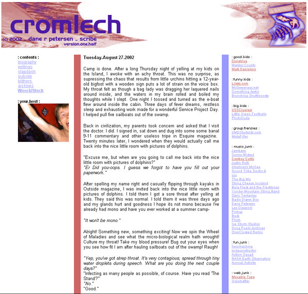
Special thanks to Travis Beckham for his hot background patterns. Seriously, half the the internet is usin’ his stuff, and I don’t think he gets near enough credit. Wounded Knee uses pattern 130.
Props go to XPAIDER for the schweet retro font used in the new Brainside Out logo. Unfortunately, the XPAIDER website blocks any web browser except for Internet Explorer 5.5 and above, and that makes me want to cry molten tears. I did tell them how I really feel, and that will teach them to give away their quality worksmanship for free.
The wolf paw is from the well-known cultural stylings of Wuda Wooch! This particular one was inked on a flag that belonged to my Duluth roommate Tom. I hear that these days Tom is teaching at an elementary school or married or dead or something. Whichever it is, more power to ya, Tom!
Hover states for the header, footer and navigation links are done purely in CSS, using Pixy’s Fast Rollovers Without Preload technique. The image replacement code was inspired by the technique used by Jeffrey Zeldman on his site, which I particularly liked because it didn’t require any ugly hacks for fussy browsers. It is the Phark Revisited technique, and you can learn all about it (and all its kooky siblings) at David Shea’s little nook.
I’m doing something kind of interesting with the logo image in the header, a technique I discovered while working on a client site. To help shave bandwidth on an image that overlays text on a photographic background, I will sometimes render the background as a jpeg and the text as a gif with transparency.
To get the logo gif to anti-alias correctly, I will run the background image through a gaussian blur filter until I can sample an average background color, and then I paste the logo layers on top of that color. I magic wand and delete the background color with zero tolerance and no anti-aliasing, crop right up against the logo, save it as a gif, and position it over the background using margins and/or padding. There are a few advantages to this approach:
- You can typically shave a few kilobytes off image size, as the background is happy to be rendered as a simpler jpeg file, and the logo is happy to be rendered as a smaller gif file. This is especially useful if you are using Pixy’s rollover technique, and you need to use larger images to render your rollover states in the same file.
- There is no variance in jpeg artifacting on the background when the logo hoverstate is initialized. Only the gif is swapped out, and the gif ain’t the whole image.
- If you aren’t happy with the placement of your logo relative to the background, you can adjust margins and jostle it around pixel by pixel, without editing the image file. If you’re anything like me when you hack together a design, you keep a shoddy history of layered files that are all outdated and not very hot compared to what you ultimately churn out.
Of course, in its implementation on Wounded Knee Edition, this technique failed painfully on the first count. I think it bloated my header file size by, like, 20K. The size of the gif image in relation to what I truly require for the rollover state is far from optimized.
Sure. It may be lousy, but it’s my lousy!
While studying Douglas Bowman’s beautiful three-column layout at Stopdesign, I came to a sudden realization as to how one can achieve the look of a tabled layout (with multiple columns that stetch automatically to each other’s heights) without using tables. I’ve seen tons of different techniques for doing it, but they all seem to require ugly nests of semantically meaningless <div> tags that make me feel ill.
It occurred to me that I was going about the problem backwards, in that I was trying to figure out how to get each element to “stretch” to the height of the longest element; to force them to fill up the dead space not populated by content. However, the solution was not in the elements and what they contain, but in their containing element.
I assigned a small, vertically tiling background image to my div#whopper element, which wraps my header, footer, navigation and content elements. Bammo. No matter what I put in the navigation column, no matter what I put in the content column (words, pictures, dead armadillos, abstract concepts of time and beauty, etc.), everything appears at the same height and looks pretty.
Check out the mysterious fellow silhouetted in the navigation… pretty neat, huh? Navigation is marked up as an unordered list, and the hover states are achieved with Pixy’s technique, swapped background colors, and padding.
As far as I can tell, everything displays perfectly in IE6.0/Win and Opera 7.5/Win. Mozilla and Firefox are having strange hiccups in rendering the borders between navigation links, and IE5.2/Mac likes to make the border between the navigation and content columns disappear. The CSS validates and the page layout validates as XHTML Strict.
The way I play fast and loose with content, however, will likely blow up my XHTML validation on just about every page. Until I reign myself in, then, I won’t be putting any of those cute CSS buttons anywhere on this site. So forget it. And quit asking.
