October 19, 2004
Wounded Knee: A Distressed Photoshop Tutorial

Many months ago, Shannon requested that I draft up a tutorial on the image effects seen here on Brainside Out: Wounded Knee Edition. Most of the work here is the result of graceful accidents, so it was rather difficult for me to systematize any of my processes. Now that I’ve had a bit more time to experiment with it, I’ve found my actions predictable enough that I can rig up a little tutorial for ya’ll. Without further ado, I present to you Wounded Knee: A Distressed Photoshop Tutorial.
The raw inspiration for my photographic post-processing came from Jake Ingman’s lomo effect, originally published years ago on Redscreen.net. Redscreen has since gone defunct, but we can only hope that some day Jake will revive it. That boy does some amazing things with his camera.
Really, I have documented two processes, here: the first tells how to achieve some rich, colorful depth in a photograph (a modified lomo effect), and the second tells how to distress and texturize an image to your heart’s content.
The (modified, no longer quite so) Lomo Effect
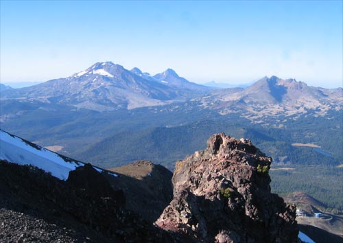
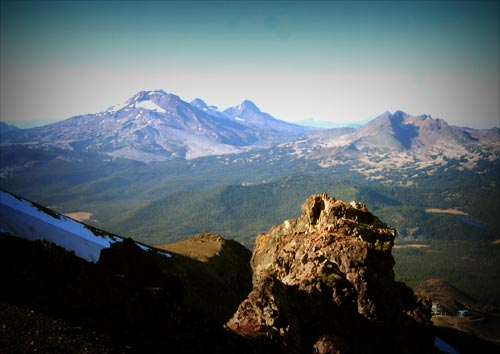
1. First, get a good photograph. The better your source, the better your results. For our purposes, we will be using a photograph of the Three Sisters and Broken Top.
2. Open up Photoshop. From here, you have two choices. If you’ve never gotten your hands very grubby in Photoshop, you might want to opt for the easy way. If you’ve knocked around in the program a bit and feel pretty comfortable with it, try the hard way.
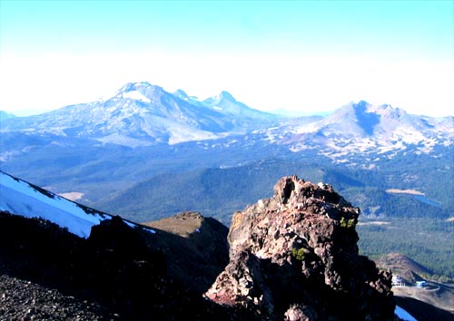
The Easy Way: Adjust the brightness and contrast for your photograph so it looks super rich. We’re talkin’ ridiculously rich, here. Typically, +15 brightness and +25 contrast is a good start, but your needs will differ depending on your photograph. Use good judgement. I trust you.
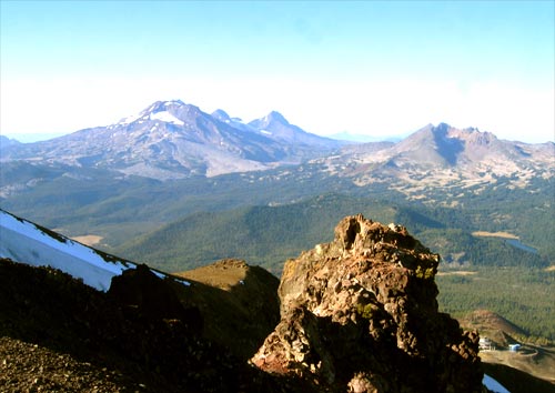
The Hard Way: If you want, you can achieve a similar effect by adjusting the levels on your photograph. This requires more time and finesse, but lets you get much more vivid results than by adjusting brightness and contrast alone.
Open the levels panel, and adjust the master RGB slider until you are satisfied with the richness. Then, adjust each color channel individually to achieve the tone you’re looking for. I’ve been experimenting heavily with “yellowing” my photographs, by pulling the middle blue slider to the right, and the middle red and green sliders to the left. With experimentation you’ll eventually find the look you want.
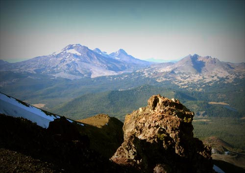
3. Now for the lomo effect. Choose the Rectangular Marquee Tool, and note the “Feather” field in the options window. Set the Feather value to approximately 1/6 the value of the longest edge of your photograph. For example, if you’re working with an 800 x 600 photo, you would want to set Feather to about 130 pixels.
4. With the Rectangular Marquee tool, select the entire image. You will need to do this by hand (no CTRL+A, for you shortcutters) or the feathering will not work.
5. Select the inverse of your feathered selection (either Shift+CTRL+I or Select>Inverse… Mac users, you know the drill… instead of CTRL, use that Apple sucka).
6. Create a new layer. Press ‘D’ to switch your foreground and background colors to black and white. Make sure you’re working on your new blank layer, and with your feathered, inversed selection still selected, hit ALT+Backspace to fill in the space. You can also use the Paint Bucket tool… I’m open minded.
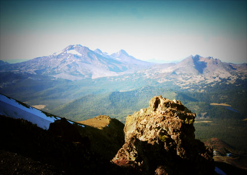
7. Deselect everything and duplicate the layer (dragging it to the “New Layer” button in the Layers window is the easiest way). The edges of your photograph should be nice and dark, now. Change the blending mode on one of the black layers to “Overlay” and the other one to “Multiply”. I really like how that looks. I especially like how it looks with the multiplied layer on top of the stack, and the overlayed layer right underneath. Again, your own experimentation will yield fruitful results.
8. Create a new layer. Select the gradient tool (it might be hiding under the Paint Bucket tool). Hit ‘X’ to swap your foreground and background colors. In the options bar, select “Radial Gradient” and make sure that you have ‘Foreground to Transparent’ set as your gradient type. Ultimately, you should have a white gradient that gives way to transparency.
9. Click in the middle of your photograph and drag a straight line to the furthest edge of the canvas. This will throw down a round white gradient right on top of everything.
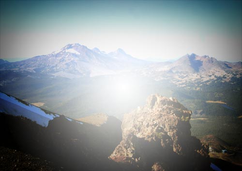
10. Change the blending mode for your new white layer to “Overlay”, and bring the opacity down to 40 percent or so. Again, set it to whatever looks best for your photograph. In our example, I have set the opacity on the gradient layer to 60 percent.
Looks pretty nice, eh? That’s all it takes.
Extra Credit
If you want, you can further tweak the colors in exciting ways. Select the layer with your original photograph, and open the Hue/Saturation tool (CTRL+U).You remember all that richness we did coming out of the chute? Well, lately I’ve been in more of a mood for the washed out look, so I like to yank that richness out in a fancy little way.
First, bring the photograph’s saturation up, way up, to 40 or so. Hit OK. Open the Hue/Saturation tool again, and this time pull the saturation way down, right around 50. Trust me, it makes a difference in the depth of color if you pull the saturation up before pulling it down. At least I think it does. Many times, I’ll drag the saturation up, hit OK, drag it down, hit OK, and keep repeating that process five or ten times to get the colors just the way I want them. Maybe it’s just a psychological problem of mine. Anyways, take a look.
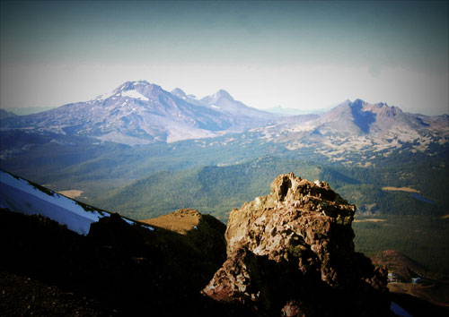
We’ve done everything now but the wounded paper texture. You can bail now, or trudge forth and do some texturization.
The Wounded Paper Effect
1. Here is a dirty little secret: My favorite source for textures is in the meat world. All the images that I’ve distressed for Brainside Out use real life, honest to gosh textures. I will take a sheet of paper, crumple it up, unfold it, crease it, drive over it with my car, leave it out in a rainstorm, do pretty much whatever sadistic things my brutal self desires. I will typically trash a sheet of paper, give it a chance to dry out, and then scan it into my computer with a lousy scanner.
Anyways. If you don’t have a scanner, or if you don’t have enough cruelty to do some good distressin’ by hand, you can use a sample of my own devising.
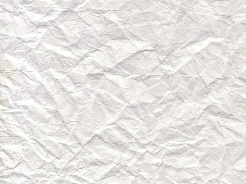
2. Open your distressing texture in Photoshop. Select the whole thing, and paste it into a new layer on the image that you want to distress (let’s say, the image that we were just working on).
3. If the size of your texture is off (and often times if it came raw from the scanner, it will be far too large), use the Free Transform tool (CTRL+T) and shrink the layer down to a more appropriate size. Remember that when resizing, you can always constrain proportions by holding Shift as you drag the corners.
4. If you pasted and resized your texture properly, you now have a huge sheet of paper that completely obscures your image. Let’s fix that. First, if your texture layer isn’t on the very top of your layer stack, move it there. Change the blending mode to “Multiply” so you can see the rest of your image shine through your texture.
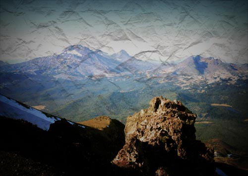
5. Now comes the fun artistic part. Adjust the brightness and contrast sliders for your texture layer until you are satisfied with the impact of the texture. If you find that the texture layer washes out the photograph too much, feel free to pull down its opacity. Also experiment with other blending options. I’ve had a lot of success in using a single “Multiply” layer to achieve the bulk of my texturizing, and duplicating that layer as a barely opaque “Overlay” to emphasize the highlights.
6. That’s it. Wasn’t too painful, eh?
If your curiosity has been piqued, a number of people far more skilled than I have written tomes on techniques similar to this, often referred to as the “Wicked, Worn Look”. In all actuality, this look was really popular back in June and I’m way behind the curve in documenting it… but hey, we’re going for an aged, timeless look here, right? We’re not just following trends. Heck no.
Why, I’d venture to say that we here at Brainside Out are, like, all anti-trend and such. But we’re not anti-trend in a trendy kinda way. Because if the trends manage to co-opt the anti-trends, then they’re not the anti-trends anymore, are they?
Cameron Moll: That Wicked Worn Look
Jason Santa Maria: Aged Aesthetic
Blake M. Scarbrough: The Awesome Antiquated Look
Ryan Sims: Weathering: Subtle. Restrained.
Greg Storey: Academics of Worn
That’s the thing I love about photoshop. I can do some cool stuff in it, too (mostly color, web, and typography stuff), but you can always learn more with tutorials like this. Thanks, man!