If you’re looking at this page through Internet Exploder you’re probably wondering when I got kicked in the head by a horse. Why else would he make such strident efforts to make this thing so butt ugly? I assure you my head is fine, and the reasoning is due to other matters.
First, let’s get something straight: 95 percent of the online human population uses IE. 95 percent of the online human population has been hoodwinked by the worst web browser thrust upon mankind. Now let’s get something else straight: Web design is one of the least rewarding and most thankless activities conjured up in the last 6,000 years of human civilization. We slave away, upload and refresh until our page looks perfect in our casual previewing browser, only to watch the whole thing explode as soon as we switch platforms. I typically preview my pages in Opera 7 because it has wonderful support for web standards. I load my pages in IE only when I feel a need to exponentially increase my rage quotient.
Finally, let’s get something else straight: I love web design. Some people love hanging cinder blocks from their nipples and eating floor wax. Humans are strange animals.
The sad tale is that I retooled my links in the navigation bar to mimic buttons. This is all done through CSS instead of javascript and images. Fair enough. I got it semi-working in Opera, except that I was getting unpredictable color changes in the button text. After poking around in the stylesheet and HTML code I found that the button links were incorrectly inheriting the style of the #navigation element that the .nav-button element was nested in. In CSS, if two properties for an object intersect, the property that is most specific to that object is given the most weight. Children share their parents’ last name, but not that of all their grandparents.
Easy enough, but Opera was screwing it up, and if Opera is screwing something up it is definitely serious. The different background colors make it so that I can’t use the same link colors in the navigation and content windows, but the only way I could get the new buttons to display correctly was to eliminate the conflict between #navigation and .nav-button. As soon as I eliminate #navigation, however, the links in the navigation window inherit the default body colors, which are illegible on that background color. A different solution was in order.
So. I slid the default body colors to the #container element to preserve legibility on content links, and moved the #navigation colors into the default body position. The navigation buttons receive the .nav-button style without conflict, and standard navigation links inherit the body properties.
What does all this mean? It means everything works, and it’s super groovy because by using PHP includes and CSS I was able to make global changes by editing two files. Sure, editing those two files was frustrating, but so is fishing a fork out of the garbage disposal.
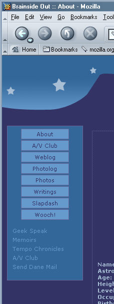
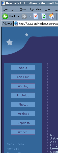
The link buttons look great in Opera. They look great in Mozilla. And that brings us to Exploder, which gets the margins wrong. Dead wrong. Here’s what I’m talking about:


The first one is Opera 7.11 for Windows. The second is Mozilla 1.4 for Windows. See how they’re remarkably similar? That’s partially because Opera is built off the open-source web browser Mozilla. It’s also because recent versions of Opera have excellent standards compliance. The last one is Internet Explorer 6.0 for Windows. Before we delve into what it gets wrong, let’s look at what IE gets right:
Background image.
Colors (that’s a no-brainer, really).
Font size.
Body margins.
Top spacing.
And wrong?
Margin between first button and top of the navigation box.
Borders coded as “dotted” appear dashed.
Margins around buttons.
IE also messes up the active fields for the button’s :hover state. Opera and Mozilla correctly change colors when you hover anywhere inside the button. IE changes only if you hover the actual link text or (strangely) the left margin. The right margin is completely unresponsive.
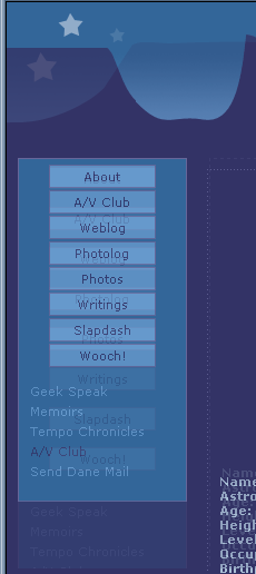
Let’s overlay the Opera and IE screenshots to see what else we can discover:

Disregard the background image, as its positioning is determined by the size of the browser window and has nothing to do with the inconsistencies we’re working with here. IE gets the top and left spacing of the navigation window, right down to the pixel. The width of the navigation window is also pixel-perfect. IE is playing a funny, funny game with margins between the buttons, and I’ll need to probe my code a bit for to figure out what’s going on in there. This makes me cranky.
Look at the borders for the content window and IE screws the pooch. The left border is off by two pixels in IE, and the text is indented three pixels too far. It aligns the top of the content window with that of the navigation window, even though it doesn’t align in Opera or Mozilla. I actually don’t know which browser is in the right, here, as my code specifies a 140 pixel spacing for both the content and navigation windows. Realize also that my code is not perfect, so I may have thrown in some funky margins or something without realizing it, or violated an unwritten rule of engagement in my clumsy attempt at the box model hack.
This is what we do.

 Today we hiked up to Gnarl Ridge on Mount Hood. If you fancy


 Have you ever wanted to learn about semiconductor physics, but find the subject so dreadfully boring that you always end up chasing squirrels, instead? Let
